Automotive UX
Mercedes-Benz. Gesture and Voice Control
An in-car interface for a Mercedes-Benz roughly ten years out, built so a driver can handle a message, a route change and a call without picking up a phone.
Context
Mercedes-Benz set the brief for the Advanced In-Car UX course on the Interaction Design MA at MOME Budapest, and Eszter Illés and I worked on it for a full semester. We were asked to design a scenario inside a Mercedes-Benz car roughly ten years out. The brief let us ignore current regulation and traffic law. Brand fit stayed a hard constraint, so whatever we made had to read as luxury and had to hold the safety standard the company sells on. We presented the concept back to Mercedes-Benz at the end of May with a working prototype on the table.
At a glance
- 23%Of yearly car crashes involve phone use, the number that set our task
- 10Production car interiors pulled apart in the competitor teardown
- 4Gestures in the taught set, each prompt offering two options only
- ±10 yearsTime horizon the Mercedes-Benz brief asked us to design for
Brief
The brief and its constraints
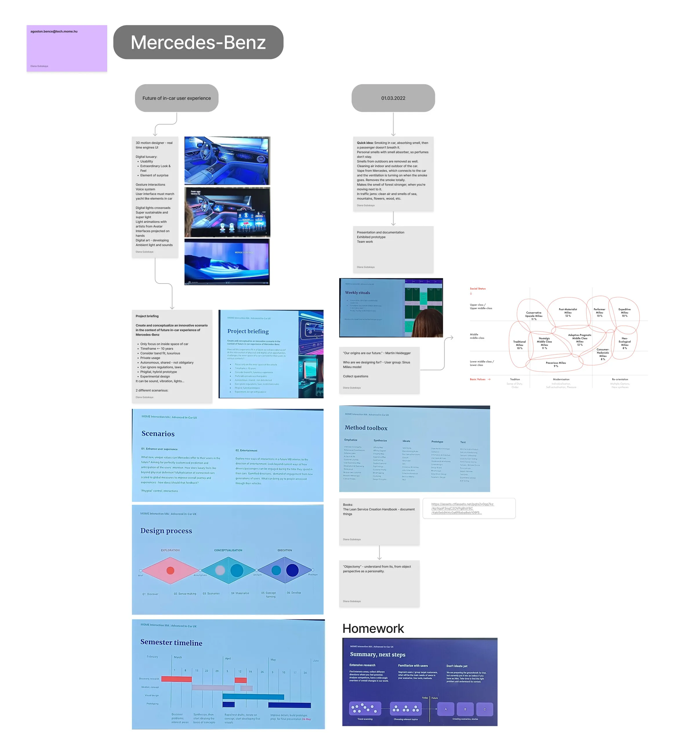
Bence Ágoston, who ran the course, handed us a briefing with six constraints and two possible directions. The constraints were narrow: only the inside space of the car, a timeframe of about ten years, private use, luxurious brand fit, a hybrid physical and digital prototype, and permission to ignore regulation. The two directions offered were “Enhance user experience” and “Entertainment”. We took the first one, because a car interior that entertains a driver is a harder thing to defend to an engineer at Mercedes-Benz.
Our process ran in three diamonds across the semester. Discover and sense-making came first, then scenarios and materialisation, then concept forming and development. I spent February and most of March on research, and in hindsight that is where the project was actually decided.
Problem
Narrowing to one behaviour
Our interview guide ran to fourteen questions and asked what people drive, what they would refuse to give up, which automated functions annoy them, and whether they eat in the car. The answers kept circling one object. Drivers described picking up the phone at traffic lights and answering messages they knew could wait, in cars that already offer hand gesture control and voice input.
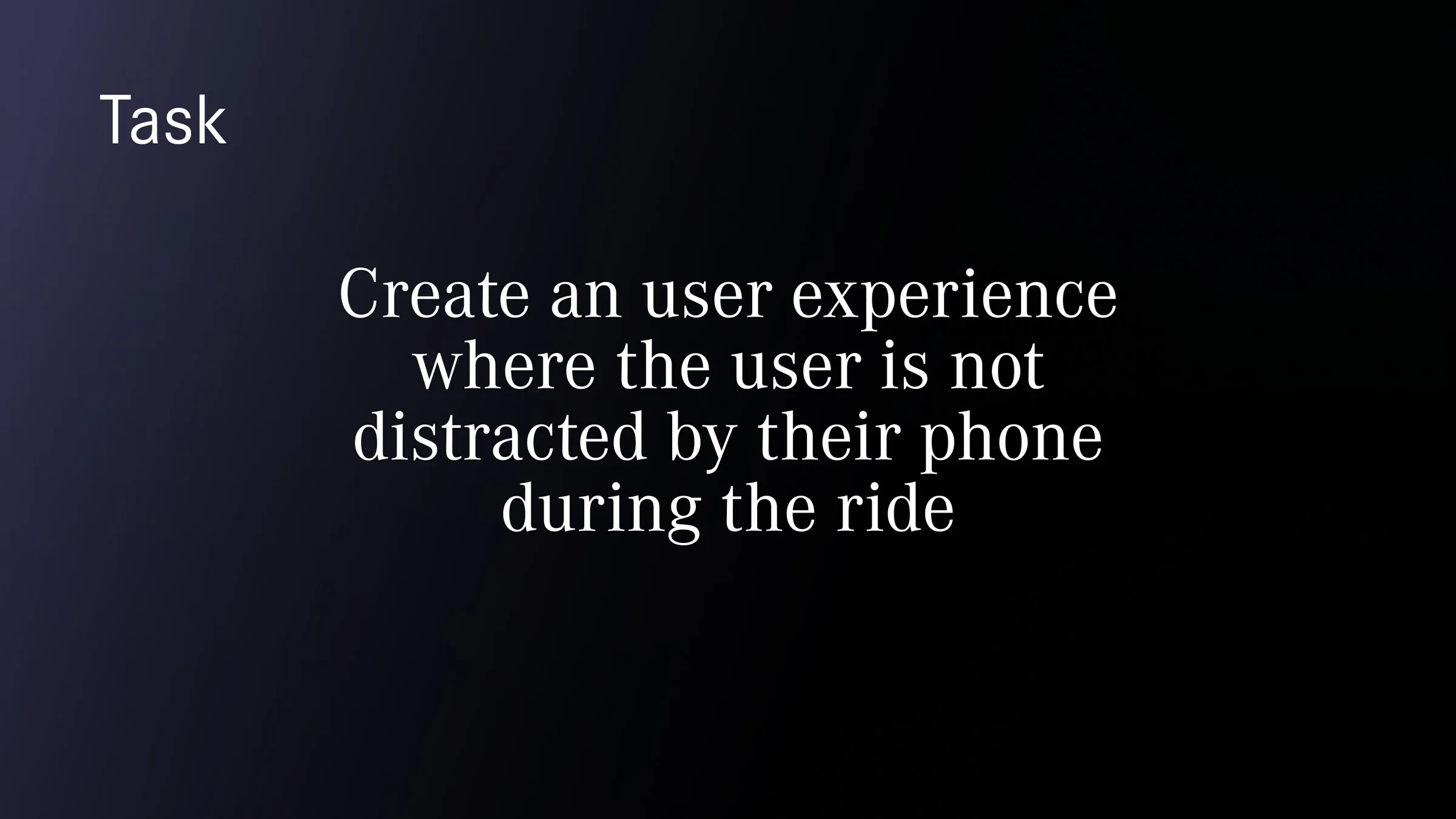
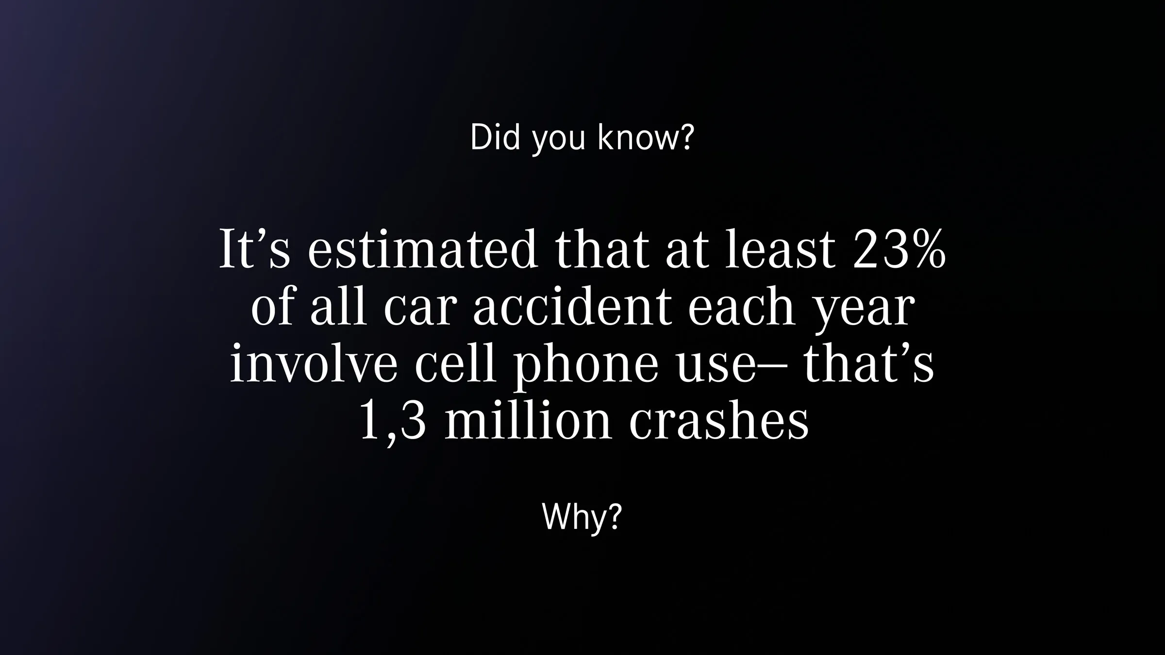
Around 23% of car accidents each year involve phone use, which works out at roughly 1.3 million crashes. That figure set the task for the rest of the semester and cut the brief down to something two students could actually finish.
Alongside the interviews I read about cognitive load in interfaces, and one idea from that reading stayed with me. If too many options reach sensory memory at once, the driver experiences it as several things talking at the same time. A dashboard that grows a bigger screen every model year is on the wrong side of that finding.
How might we
give a driver a way to deal with a message, a route change and a call without picking up a phone, using controls that never ask for a long look at a screen?
Research
How I did research
Competitor teardown
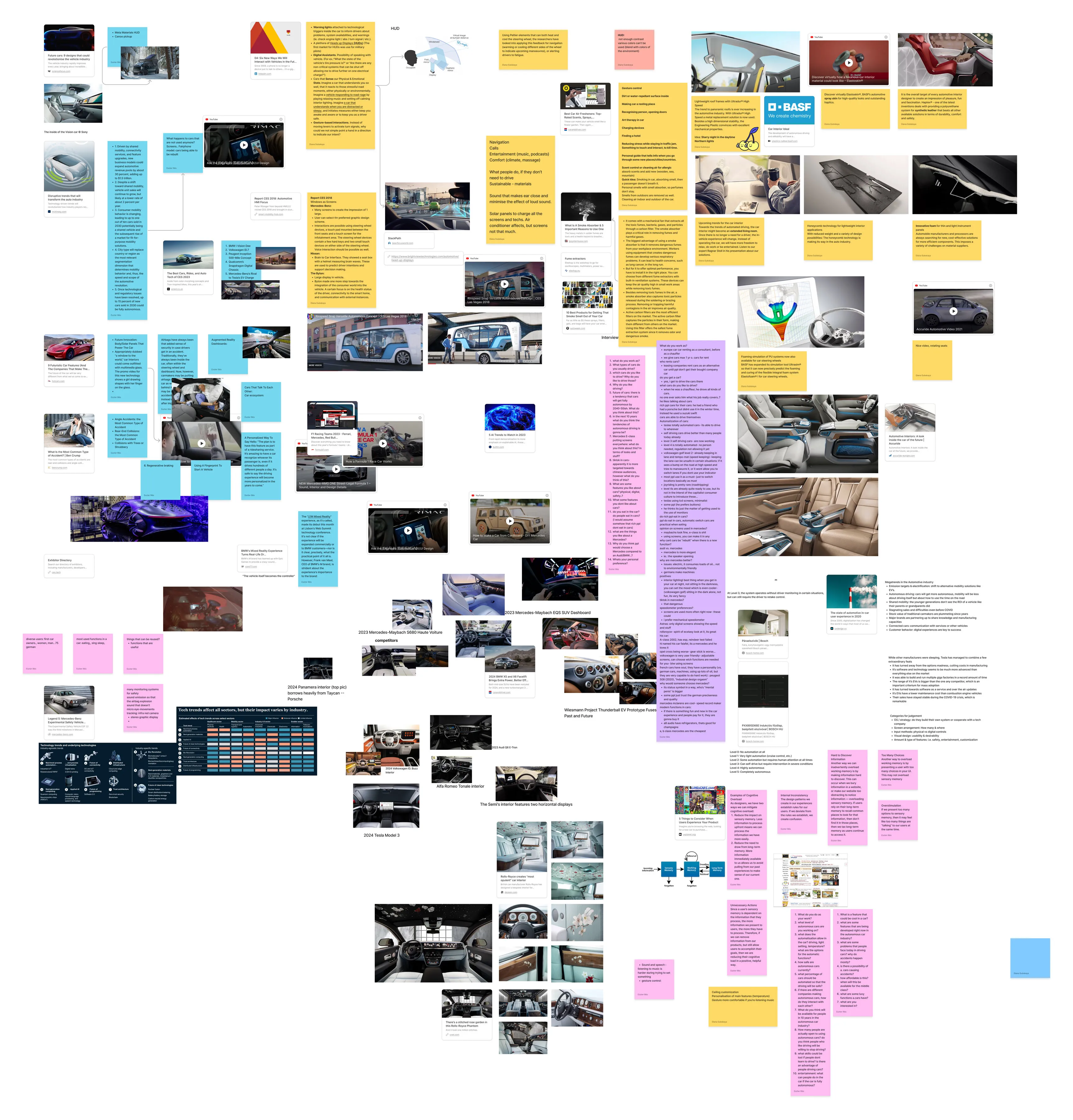
I pulled apart the interiors of ten production cars to see what each one does with screens, physical controls and voice: the 2023 Mercedes-Maybach EQS SUV and the S680, the 2024 Panamera, the 2024 BMW X5 facelift, the Volkswagen ID. Buzz, the 2024 Tesla Model 3, the Audi Q8 e-tron, the Alfa Romeo Tonale, the Rolls-Royce Phantom and the Wiesmann Thunderball. The teardown left me with two findings. Screen area is growing across the entire segment, and the Mercedes-Benz cars in the set already lean on hand gesture and voice further than their competitors do.
That second finding gave the concept a foothold in something the brand had already committed to, which mattered for a brief that named brand fit as a constraint.
I also went through the CES automotive reports, head-up display research, BASF’s work on interior materials, and the SAE levels of driving automation from 0 to 5. At level 3 the system runs without driver monitoring in some situations and still needs the driver to take control back. Our ten-year scenario lands squarely on that awkward level, which is exactly why the driver’s attention was worth designing around.
Who we were designing for
Bence pointed us at the Sinus Milieu model, and we mapped the target group onto it: the Conservative Upscale, Post-Materialist and Performer milieus sitting in the upper and upper-middle bands. A line from Martin Heidegger sat at the top of that board for the whole project, “Our origins are our future”. It kept us from drawing a car interior with no relationship to the ones Mercedes-Benz sells today.
Insights
What the research changed
Four findings survived the synthesis and went on to shape every screen.
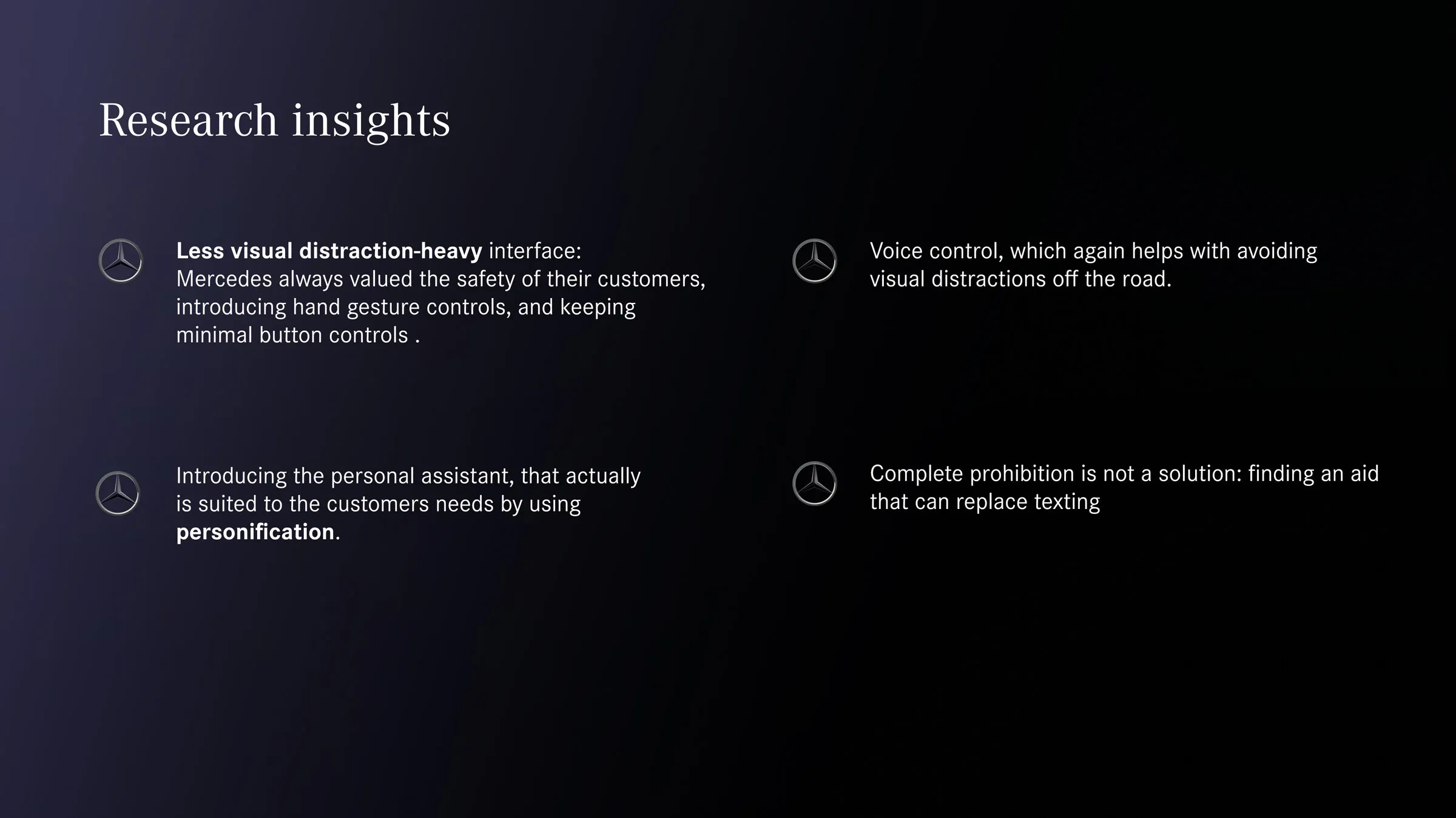
- A less visually demanding interface. Mercedes-Benz has built its reputation on driver safety, has already introduced hand gesture controls, and keeps physical button counts low. The concept had to continue that line, and a bigger screen would have broken it.
- Voice as a first-class control. Voice keeps the driver’s eyes on the road, which is the whole point of the exercise.
- A personal assistant that fits the individual driver. Personification was the mechanism we chose: a name, a personality and a set humour level.
- Prohibition does not solve this. Locking the phone out of the car would only move the problem. We needed something the driver would reach for instead, and it had to be faster than a phone.
Design
How I designed it
Two home screens instead of one
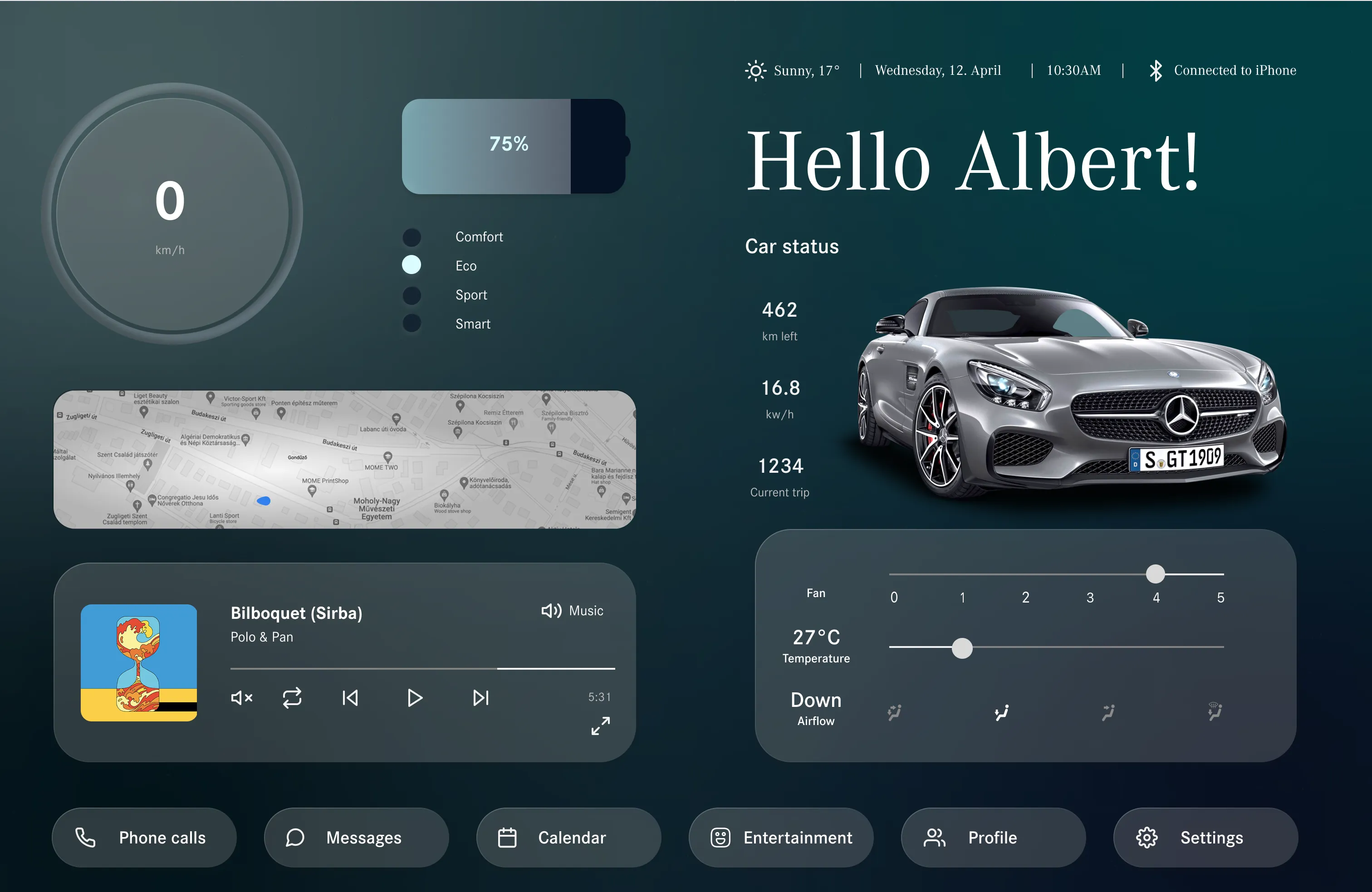
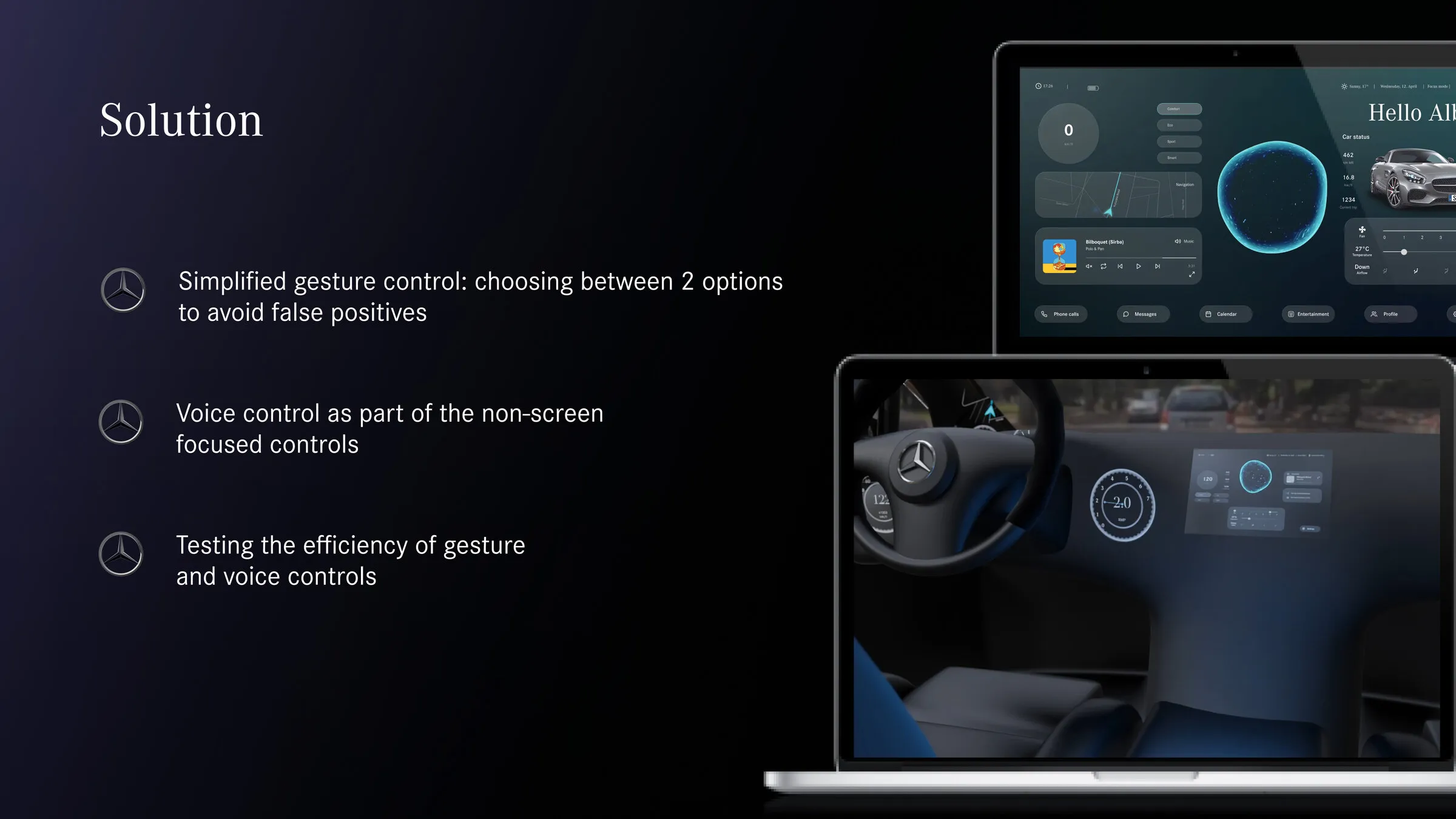
The clearest decision in the project was splitting the home screen by vehicle state. When the car is parked, the screen carries everything a driver might want: speed, charge, drive mode, a map, music, climate, car status with range and consumption, and a bottom bar holding phone calls, messages, calendar, entertainment, profile and settings.
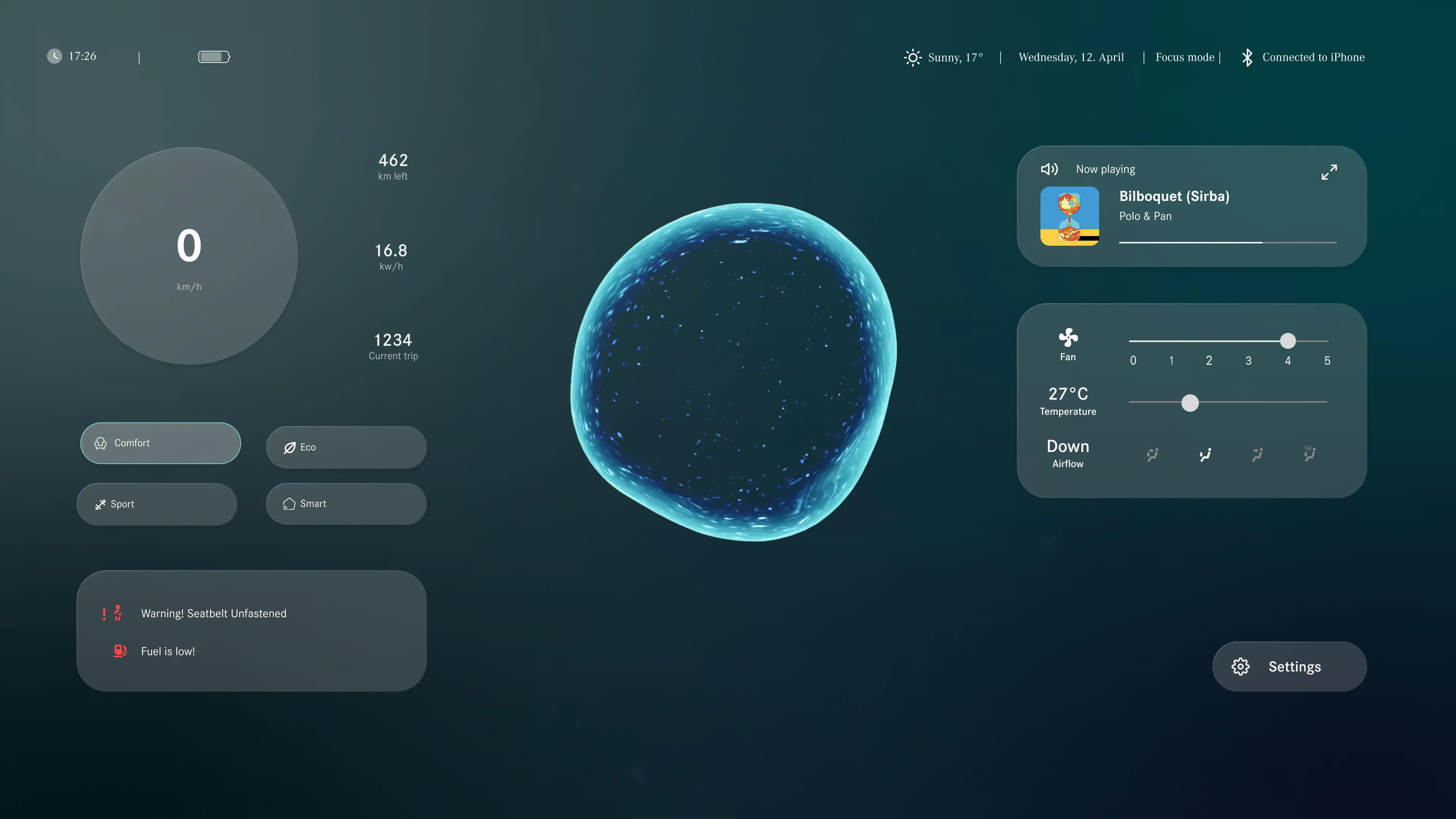
When the car starts moving, most of that disappears. The driving screen keeps speed, range, drive mode, climate, the current track, a warning area for the seatbelt and fuel, and the assistant in the centre. The bottom navigation bar goes away completely and the status bar switches to focus mode. A driver who wants any of the removed functions asks for it out loud or reaches for a gesture.
Merlin
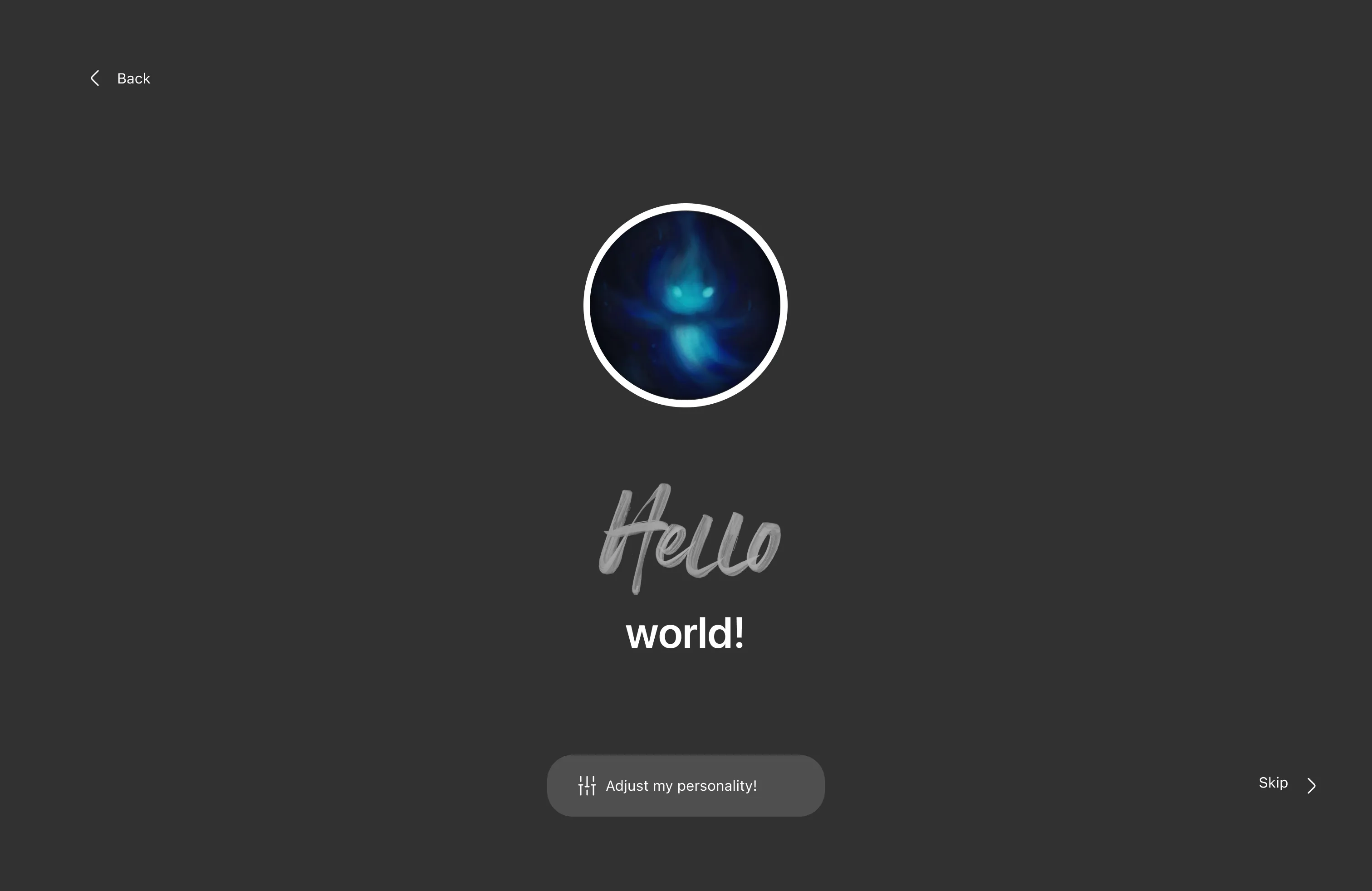
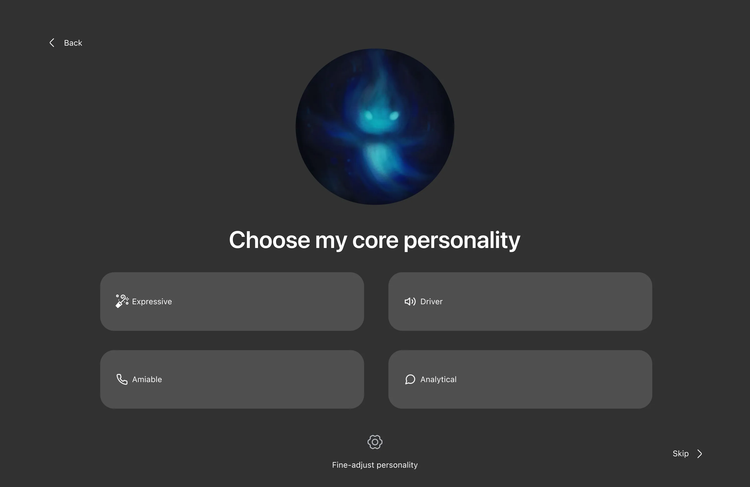
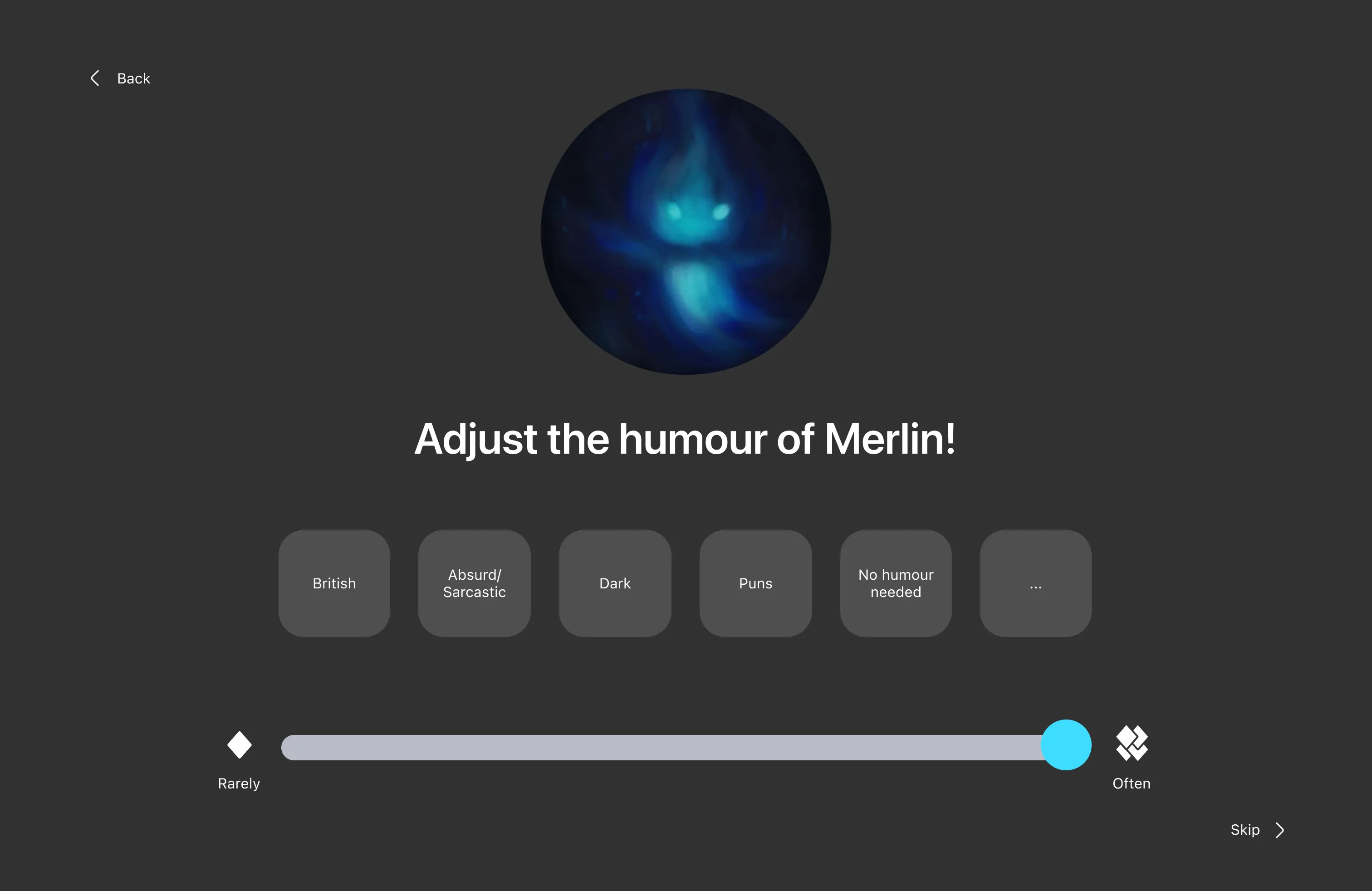
We gave the assistant a name, a face and an adjustable personality, which came straight out of the personification insight. Merlin appears as a small glowing shape and introduces itself during setup. The driver picks a core personality from Expressive, Driver, Amiable and Analytical, then fine-adjusts it, then sets a humour type from British, absurd or sarcastic, dark, puns, or none at all, on a slider running from rarely to often.
The humour screen looked frivolous when I first sketched it. The reasoning behind it held up all the way to the presentation: a driver who has named and shaped an assistant will talk to it, and talking to it is the behaviour we needed in place of reaching for a phone.
Four gestures, two options each
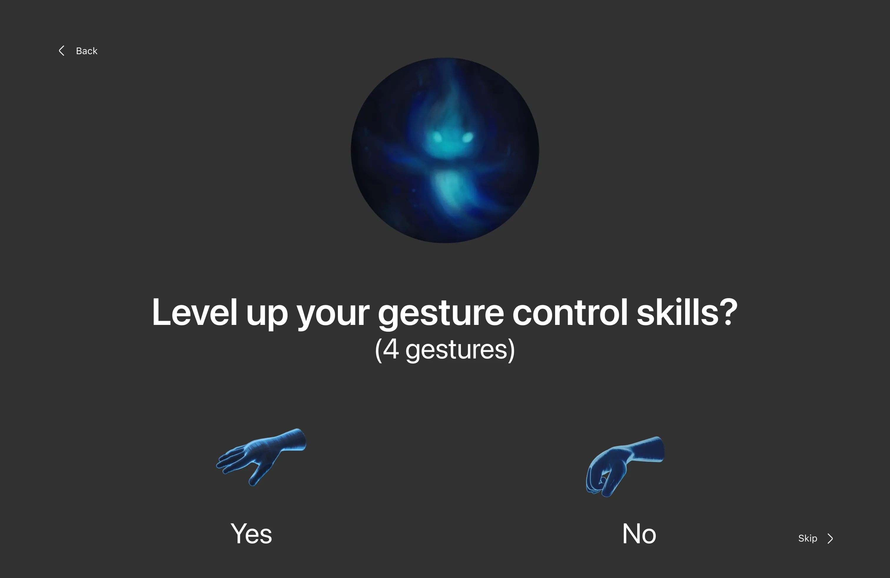
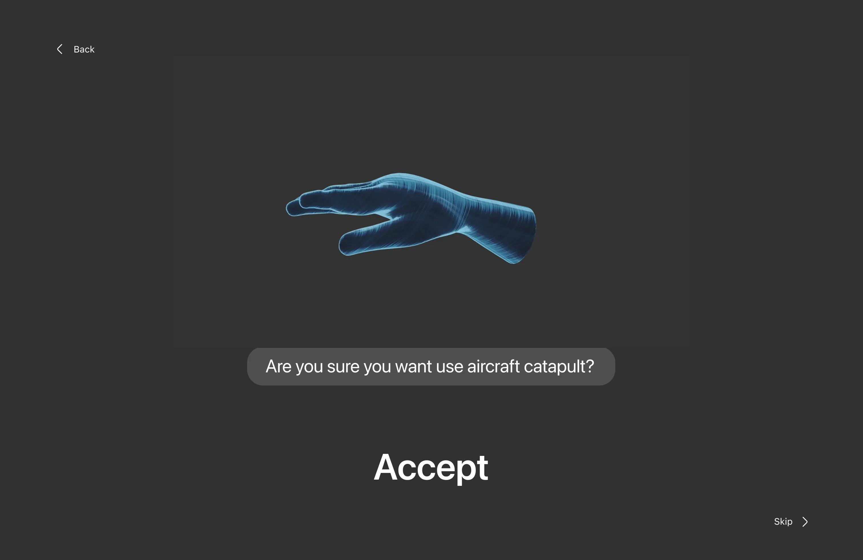
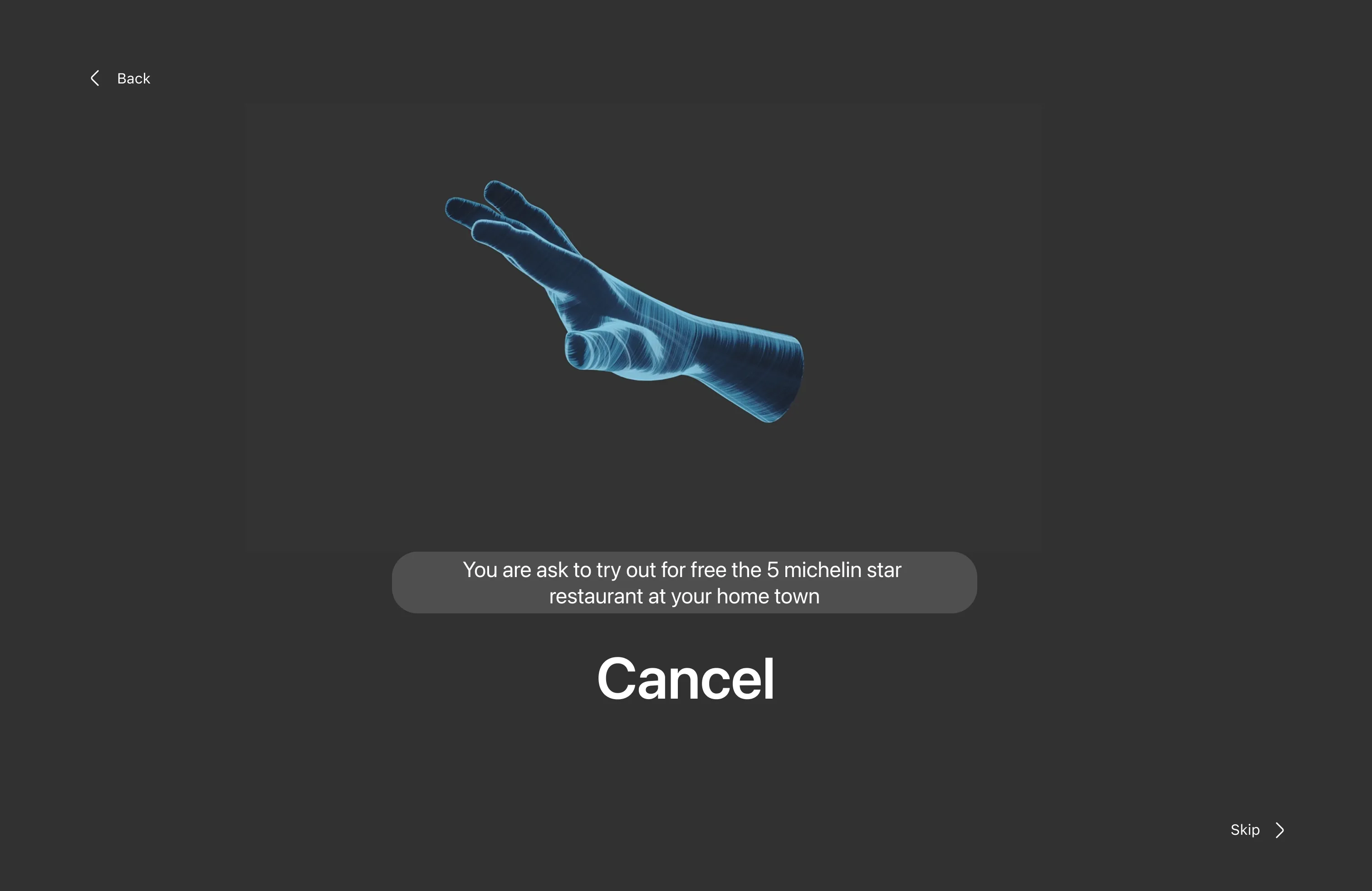
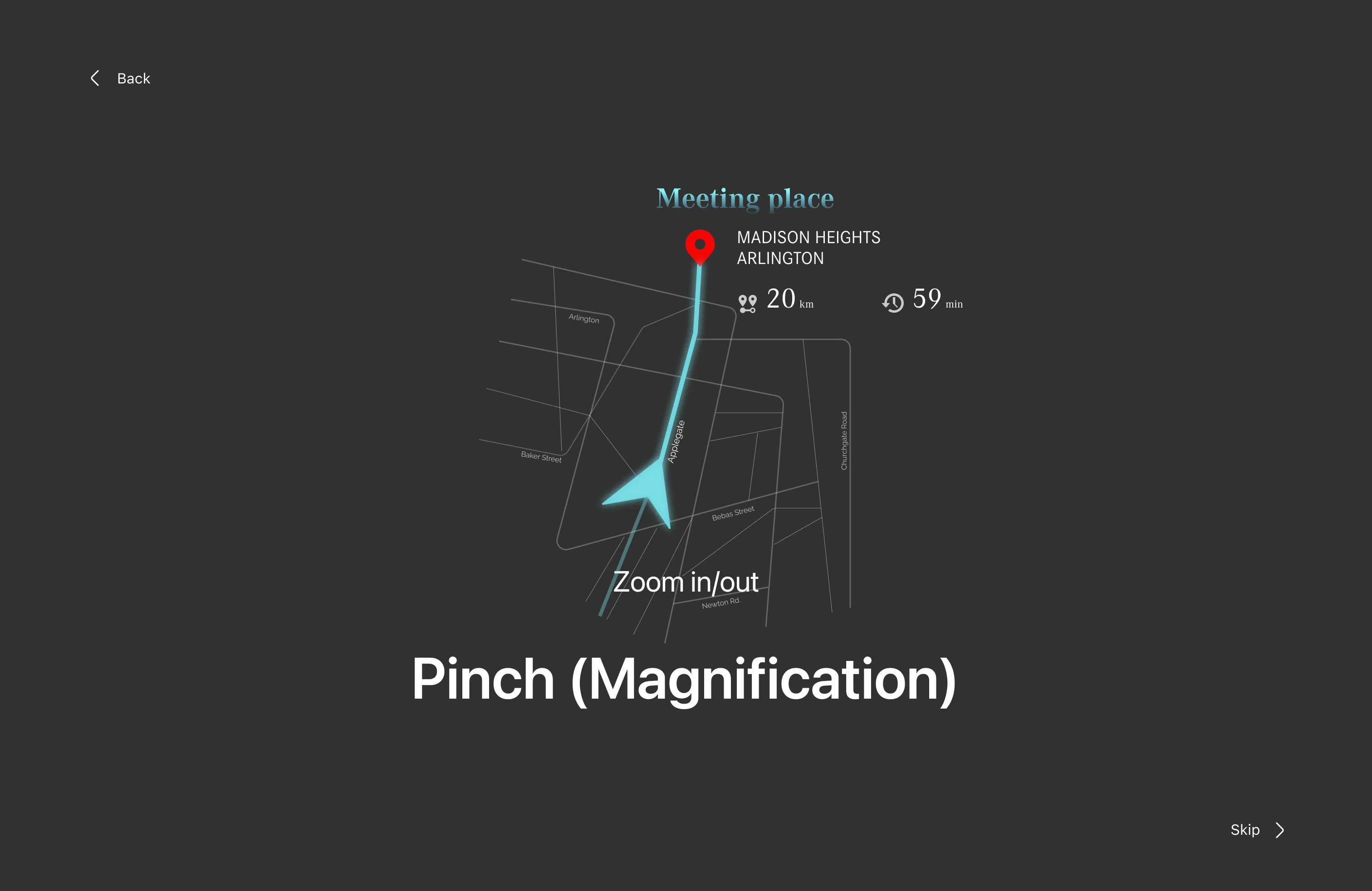
Gesture control fails in a car when the system fires on a hand movement the driver never meant as a command. We handled that in two ways. The taught set stays at four gestures and never grows on its own, and every gesture prompt offers a choice between two options only. An open palm accepts, a two-finger flick cancels, and a pinch zooms the map in and out.
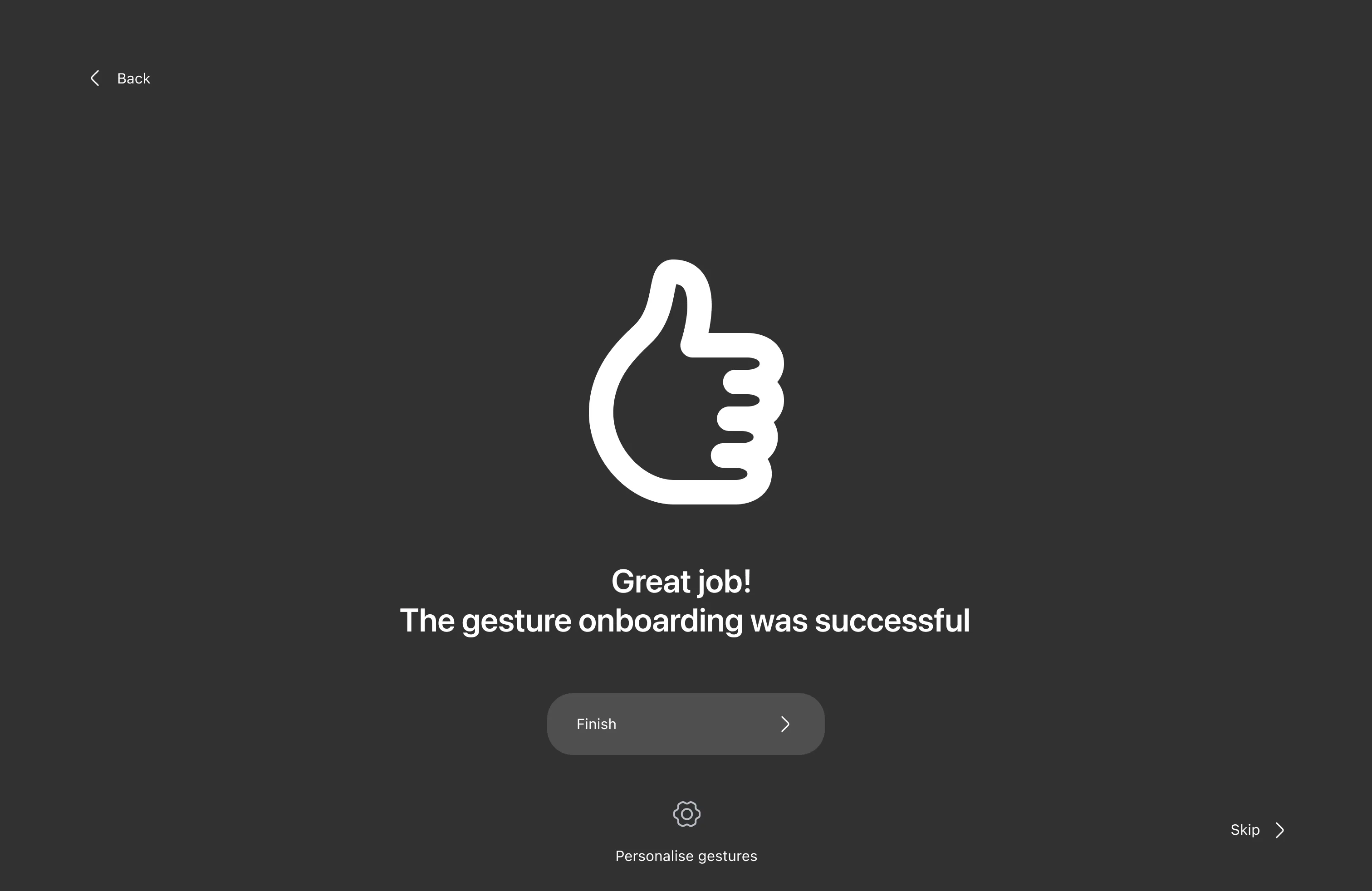
Onboarding teaches each gesture against a live prompt, and Merlin uses deliberately absurd ones so the driver is not rehearsing a real decision. “Are you sure you want to use the aircraft catapult?” teaches the accept gesture. An invitation to a five-Michelin-star restaurant teaches cancel. Those two screens got the biggest reaction in the room during the presentation, which told me the personality work was doing something.
Prototype
The prototype
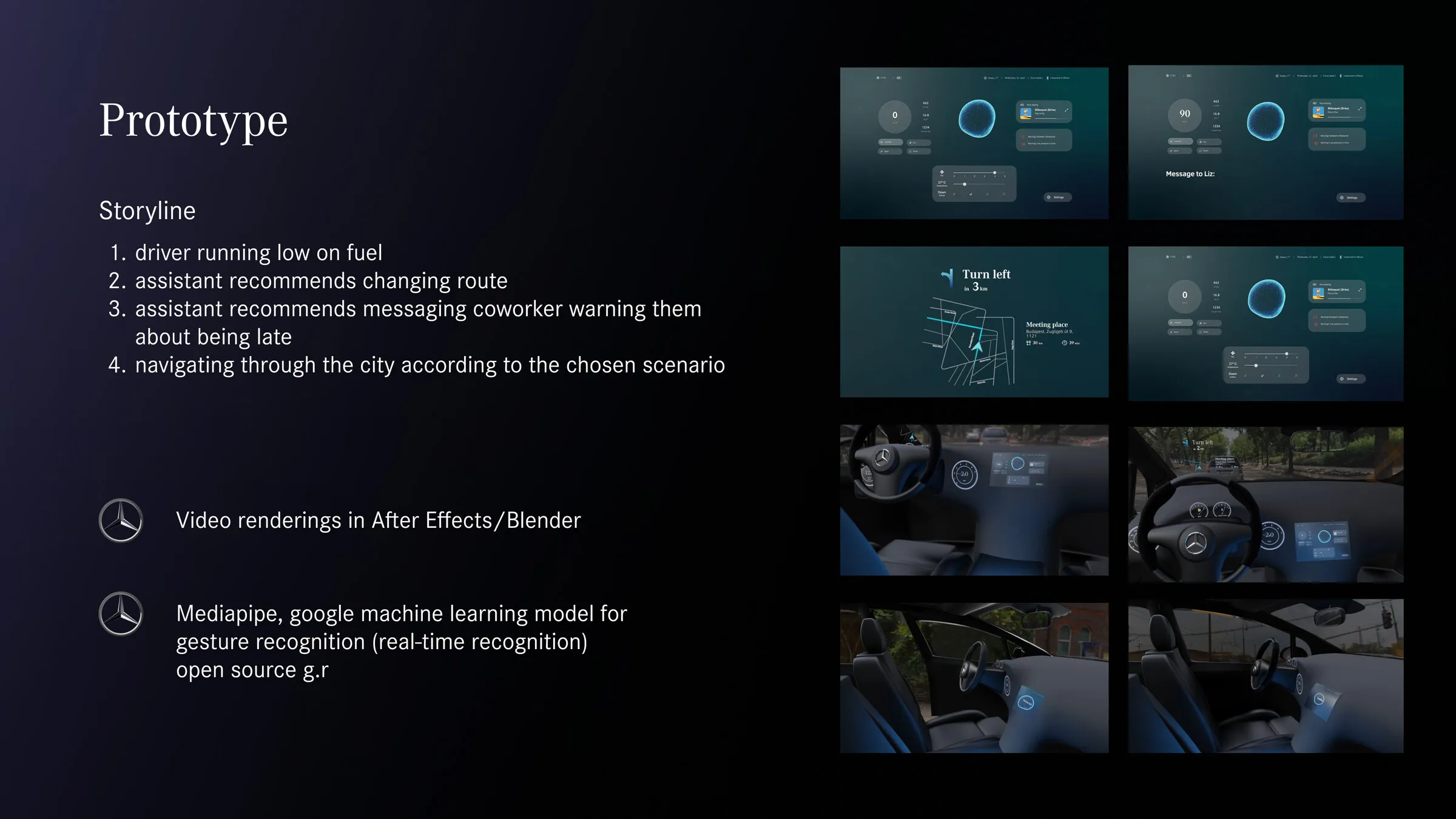
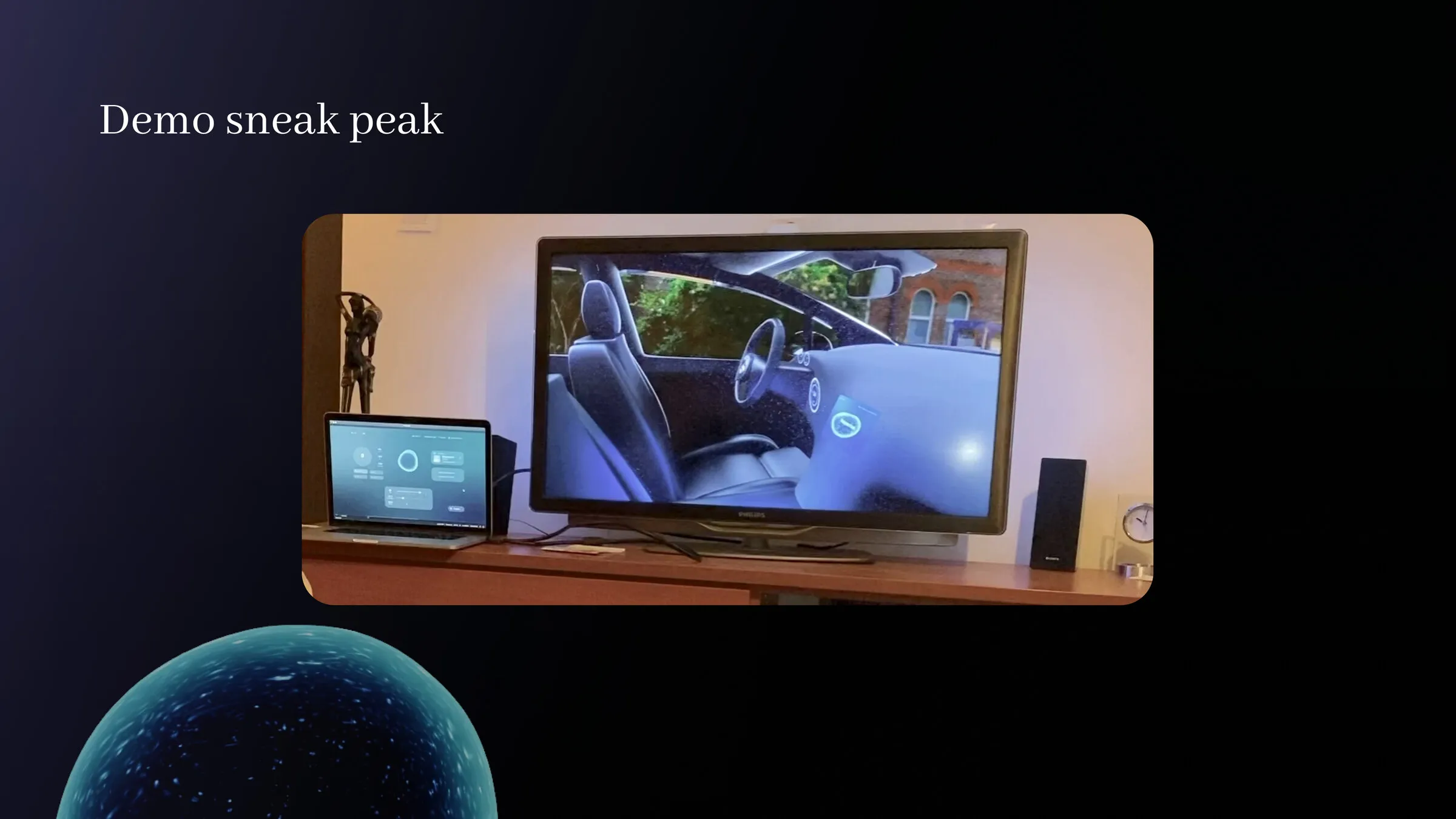
The brief asked for a hybrid physical and digital prototype, so a Figma click-through would not have counted. I rendered the car interior in Blender and animated the interface over it in After Effects. The gesture recognition ran live on MediaPipe, Google’s open-source model, so a hand in front of a webcam moved the interface in real time in front of the audience.
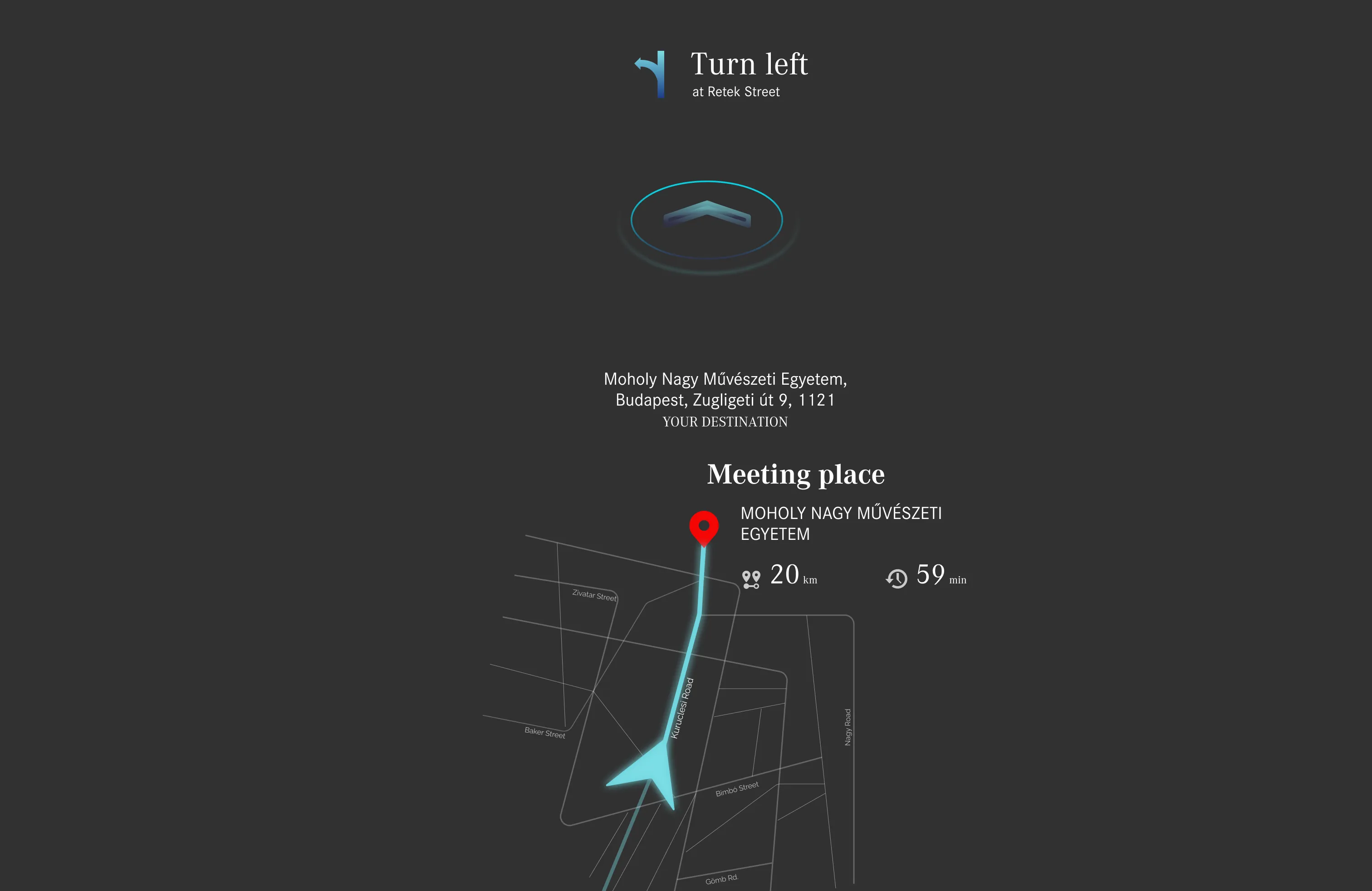
Our demo storyline has four beats. Albert is running low on fuel, Merlin suggests a change of route, Merlin then suggests messaging a coworker about arriving late, and the car navigates the new route through the city. Every one of those four beats is a moment where a driver would ordinarily pick up a phone.
Outcome
- The concept went back to Mercedes-Benz at the end of the semester as a presentation, a documentation set and an exhibited working prototype.
- A state-dependent interface that carries a full dashboard when parked and drops to speed, warnings and the assistant when moving.
- Gesture recognition running live through MediaPipe instead of being faked in the video, which let anyone in the room test the false-positive problem themselves.
- A named, adjustable assistant with a core personality, a humour type and a frequency setting.
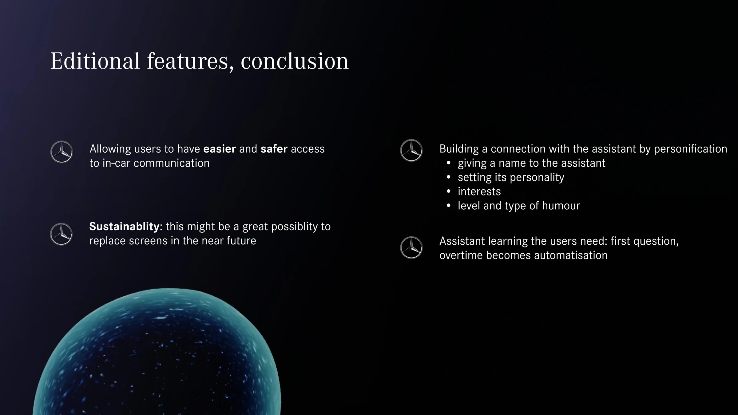
- Sustainability as a side effect. Fewer screens in a cabin is a materials argument as much as a safety one, and it came up in the closing discussion.
- An assistant that learns over time. The last piece we proposed was Merlin turning a question the driver answers repeatedly into an automation, which we scoped but never built.
Reflection
I would test the gesture set with people other than us. We validated the recognition technically and never ran a proper study on whether four gestures is the right number for someone driving in traffic, and I suspect it is one too many. The personality setup also assumes a driver who enjoys configuring things, which the Sinus Milieu segments we picked probably support, though I never checked that against a real person from those groups.
The part I would keep unchanged is the split between parked and driving. That decision came from research about cognitive load and from a competitor teardown that showed everyone moving the opposite way, and it is the piece of this project I have carried into everything I have designed since.